Change is inevitable
Hollywood has been showing or out running general application styles for quite some time, of course they are the creative folks that can come up with such !deas. But now the general public will also see beautiful applications.
For all this to happen, one should really appreciate what Apple did. I believe its Apple that showed everyone, what Art can do to computer applications. The change in MS in this direction was due to the Traction from the success of Apple’s iPhones and iPads or as they say the iOS as well as Android.
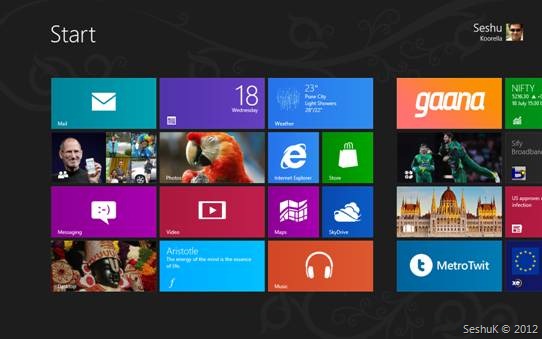
The design of Windows 8 start screen is impressive especially because the focus here has been moved to content. As they mentioned by Jensen Harris during the MS build 2011 8 traits of great Metro style apps the focus should be on content, some thing that has been taken from the Web Design, but the chromelessness (no chrome) give another direction to think about design. This enables the developers to fully utilize screen space to carefully craft the applications. We will indeed or in future see beautifully designed apps on Windows as well.
I had been thinking for some time, whenever I see a Mac, why aren’t there artistic applications designed for Windows? Well, the thought/design process has been mostly for what the OS provides.
And with the new Metro style that MS introduced, I’m sure we’ll see difference in the way Windows Applications are built. I hope this gets into LOB apps as well.
Using metro style for Line of Business apps provide more usability for users.
This is a nice start screen that introduces Live tiles. This look and feel is consistent across all Windows 8 devices. PC, Tablet (Slate) or Phone.

Live tiles also enables developers to use the tile space (rectangular) to push notifications or important changes so that the users can get a quick little update on that the applications doing without going to the apps. This is like a app preview that we had with Win 7. But the fact that the developers get their own canvas to put what ever content instead of tiny live tile makes it more useful.
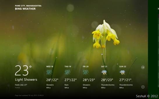
All Microsoft apps are impressive. The one I liked most is the Bing Weather App, even though it might look like a copy of Weather HD iOs App, it had its own content that tell us that its not just a copy but enough thought has been put on the design so that all necessary data is presented to the user.

One more difference that we see in Metro style is that mostly the data is painted from left to right rather then from top to bottom. We will be scrolling left to right as opposed to the traditional top to bottom. This might take some getting used to and special thought needs to be put on by the designers as well. But its not a compulsion.
Typography and Animations:
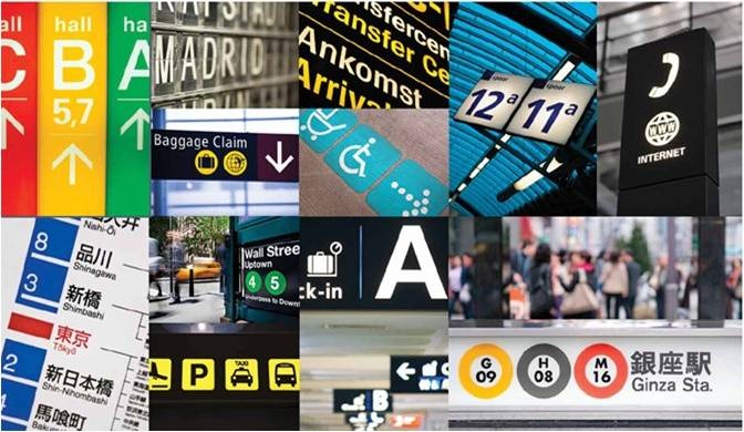
Another feature that one would observe straight away is the fonts and the animations or should we call transitions. The content that pops out when you look at a well designed metro application is the font and the important content highlighted by using bigger fonts.

This is an inspiration from real world usage at Airports, traffic signals notice boards etc. This is some thing that might help designers visualize what is more important in the content they want to present and highlight it in a specific metro design style.
Almost every update to the content has a transition built in. These include, loading of content, refresh, deletions additions etc. Most of these transitions are available for developers for free thru WinRT, new Developer API or runtime for developing Windows 8 metro style apps.
Will Add more content and more thought as I use the preview OS and others.